OneMillion's mission is to popularize, adapt and expand knowledge about the use of digital currencies in everyday life. They do this by creating an extensive ecosystem composed of professional entities from the cryptocurrency, software, marketing and financial industries. OneMillion provides users with unique tools and the necessary knowledge to function in the world of digital currencies. The innovative nature of the activities and their enormous scope forced the brand to make its image coherent and show the recipients in a unique way not only what the OneMillion brand is, but also what it intends to be.
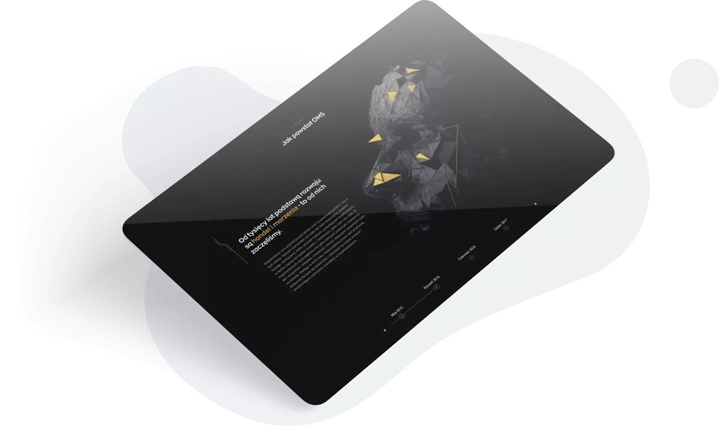
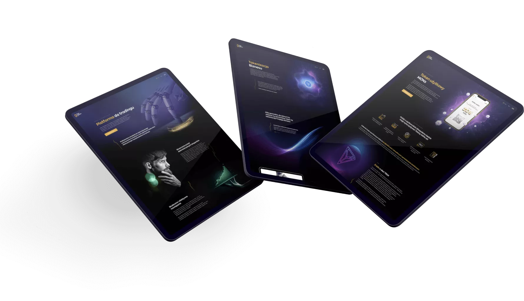
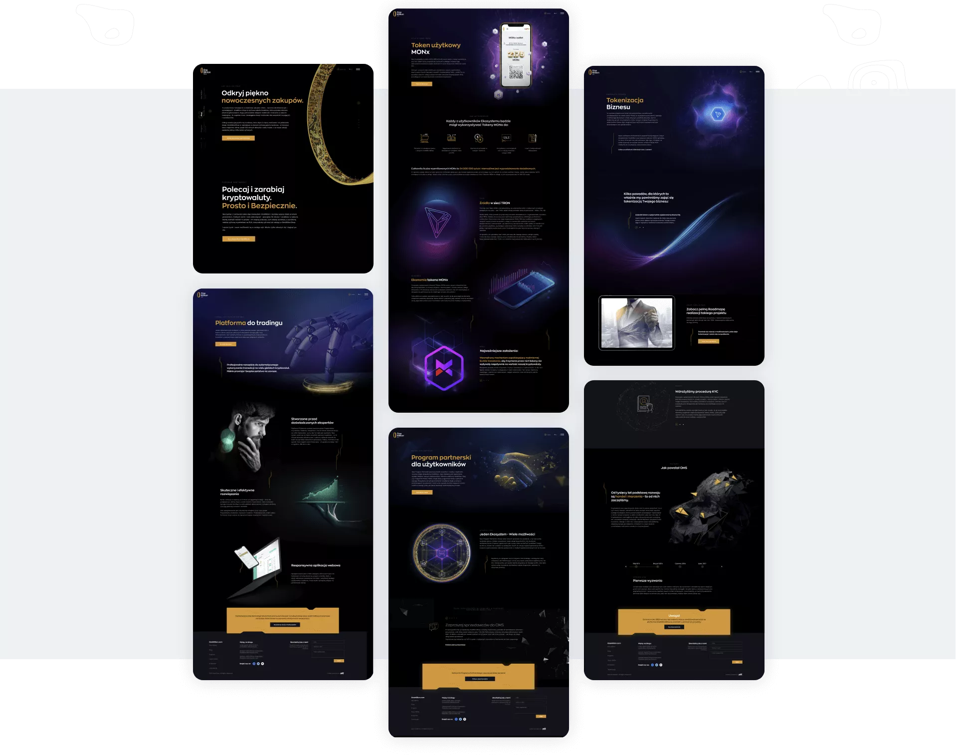
The main task of the project was to create a new website: effective, technologically advanced and consistent with the identity and character of OneMillion. We wanted to distinguish the brand as creative innovators with great ambitions. The website's task is to emphasize the enormity and momentum of the client's activities, interest and intrigue - it is supposed to be like Tony Stark, but in the world of cryptocurrencies. During the works, we also came to the conclusion that the logo needs to be facelifted and the visual identity of the brand needs to be systematized. We wanted to avoid inconsistencies and emphasize the character of OneMillion even more. Along with the visual modifications, it became necessary to provide creative support in all current promotional activities of the brand, including preparation of materials for printing, video and animation materials as well as graphics for social networking sites.
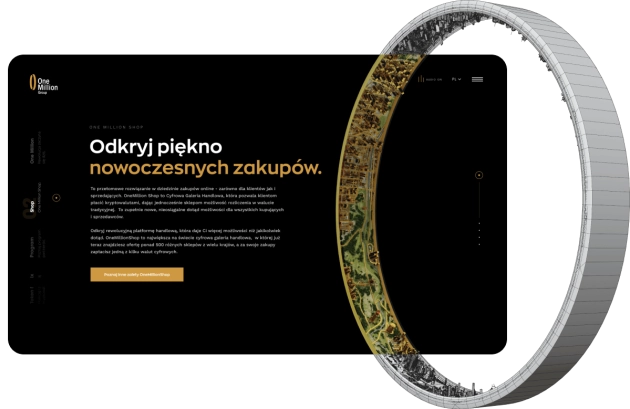
At the stage of getting to know the client's needs, we proposed three different creative concepts with varying degrees of complexity and labor consumption. OneMillion quickly made us aware of its ambitions and the scale of the project, choosing the most labor-intensive concept of a three-dimensional ring, extended with many new ideas!
In the center of the model there was to be a city where the user can enter and travel freely. The idea was really interesting, but also difficult to implement, especially in terms of optimization. After a few modifications to the concept, we decided to give it a try.
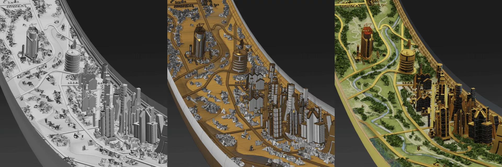
First of all, we agreed on the so-called Sprint Zero, which was to check how much we can afford. We have prepared a simplified 3d model and tested various browsers for stress.
A positive test in the zero sprint resulted in the next stage of building the target OneMillion ring model.
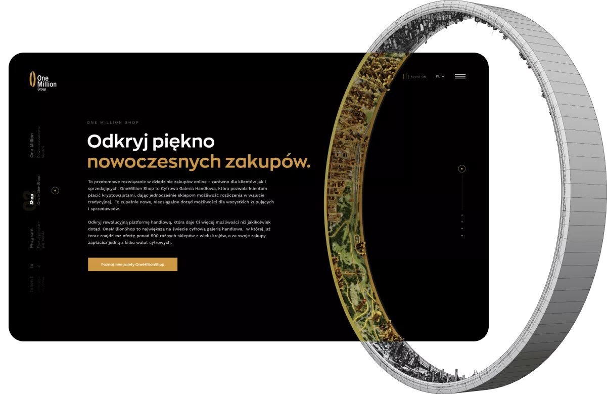
The concept of the website has evolved in the course of the work. We decided to extend the brand's impressive landing page and build a full-size website. For this purpose, we created subpages for all elements of the OneMillion ecosystem, added a blog and a separate contact page.
Logo lifting along with the development of comprehensive visual identification

A significant problem that occurred in the original version of the logotype is its typeface. Its narrow variation made it look a bit dated and was unattractive to the target audience. When designing, we decided to choose a geometric and modern typeface, which is "Zona Pro" in the SemiBold version.

The last significant change was modifying the tagline. In the original version of the sign, it was already placed outside the entire sign structure, which gave the impression of randomness and reduced its legibility in the case of very small sizes. In the refreshed version, it is already in the area of the logotype structure, thanks to which it is more legible and looks much better on graphic materials.

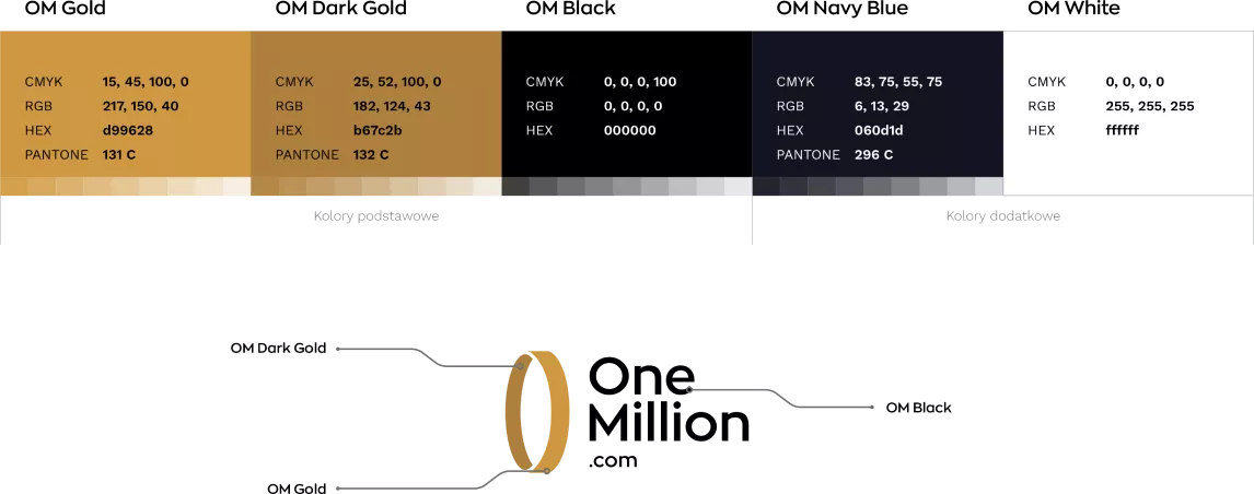
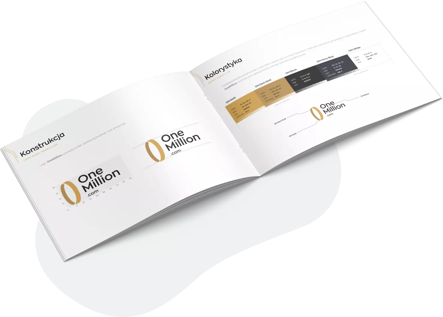
The OneMillion logo consists of a graphic symbol - a signet and a typographic part. The signet's structure is designed in the shape of a vertical circle, which symbolizes the ecosystem based on its own digital currency - MONx. The typographic part is the brand name and tagline. OneMillion is not only the world's largest trading platform, it is a complete ecosystem of various platforms, therefore the tagline has been designed in such a way that it is possible to create new versions of platforms while maintaining consistency.

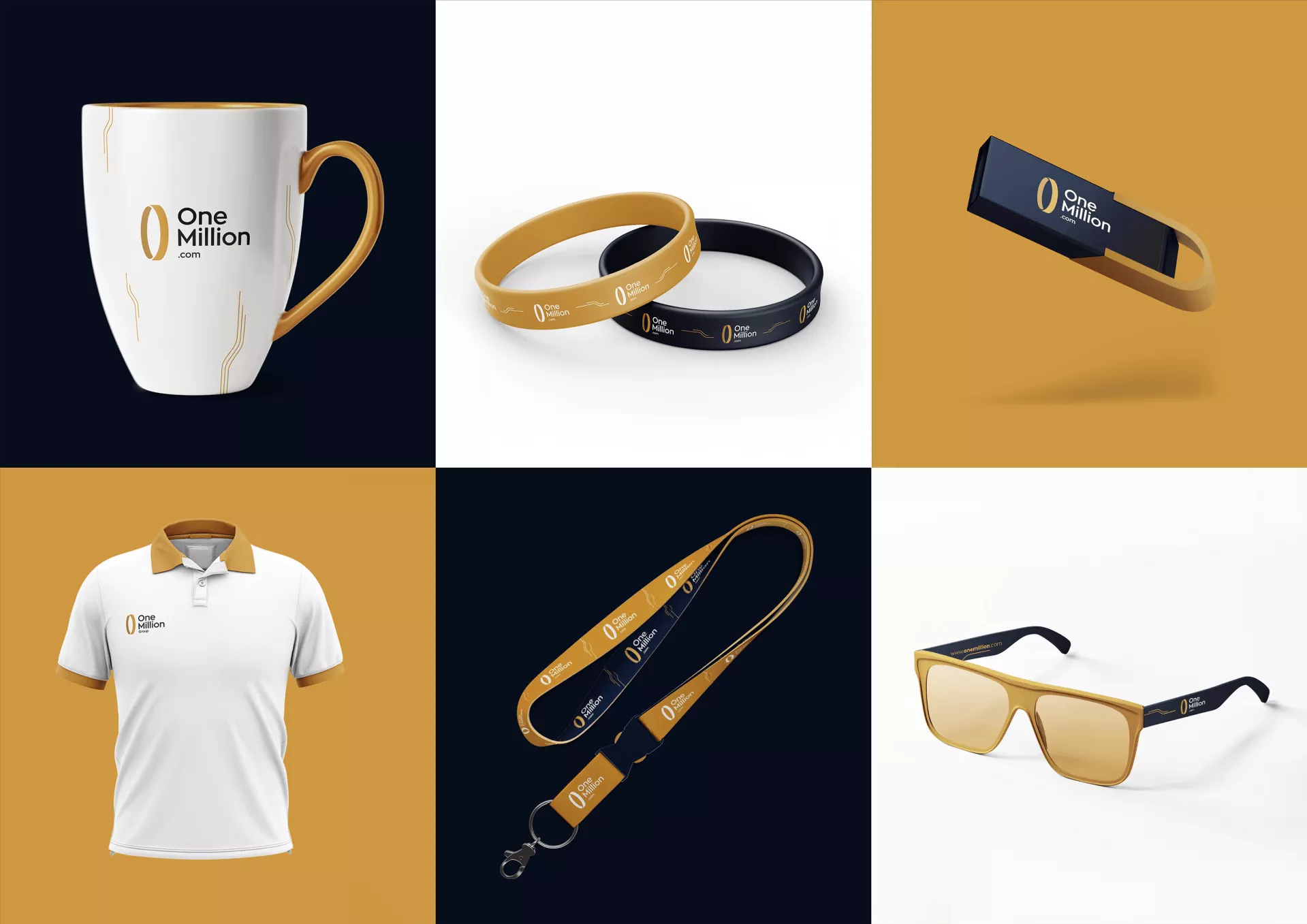
Logo lifting along with the development of comprehensive visual identification
If you liked the way we work, let us know!
We will be happy to prepare a free quote,
which you will receive within 2 business days.
