The excess of responsibilities, lack of time and the progressive aging of the society make it difficult for all of us to maintain adequate strength and vitality. The products created by the Hauster brand are the answer to the needs of the daily diet. With the help of carefully selected raw materials and modern technological processes, they create and give you preparations that are appreciated. The Hauster brand has been on the market since 2014, their mission is to provide natural and effective pharmaceutical solutions that support the maintenance of health, strength and vitality. Their goal is to care for the satisfaction, trust and better quality of life for each patient, and we believe that we contribute to the pursuit of their goal!
Our cooperation with the Hauster brand began in 2016, with the design of the brand's logotype, and turned into a permanent visual and development support, which continues to this day. When creating the brand image, we try to show that Hauster is a company that provides high-quality preparations that support the daily maintenance of health, strength and vitality, which, in turn, are appreciated and trusted by doctors, pharmacists and, above all, patients. In the activities for the brand so far, we have carried out projects and implementations of websites, branding, packaging designs, promotional materials for printing, three-dimensional visualizations, animations and many others. We believe that, in cooperation with Hauster, we have an impact on the fact that the products they offer meet the expectations of customers to the highest degree.
At the initial stage in 2016, the main need of the client was to create a logo for a company developing on the market of dietary supplements and health care.
Immediately after completing this task, we started working on the original hauster.pl website and then focused on designing individual Hauster products.
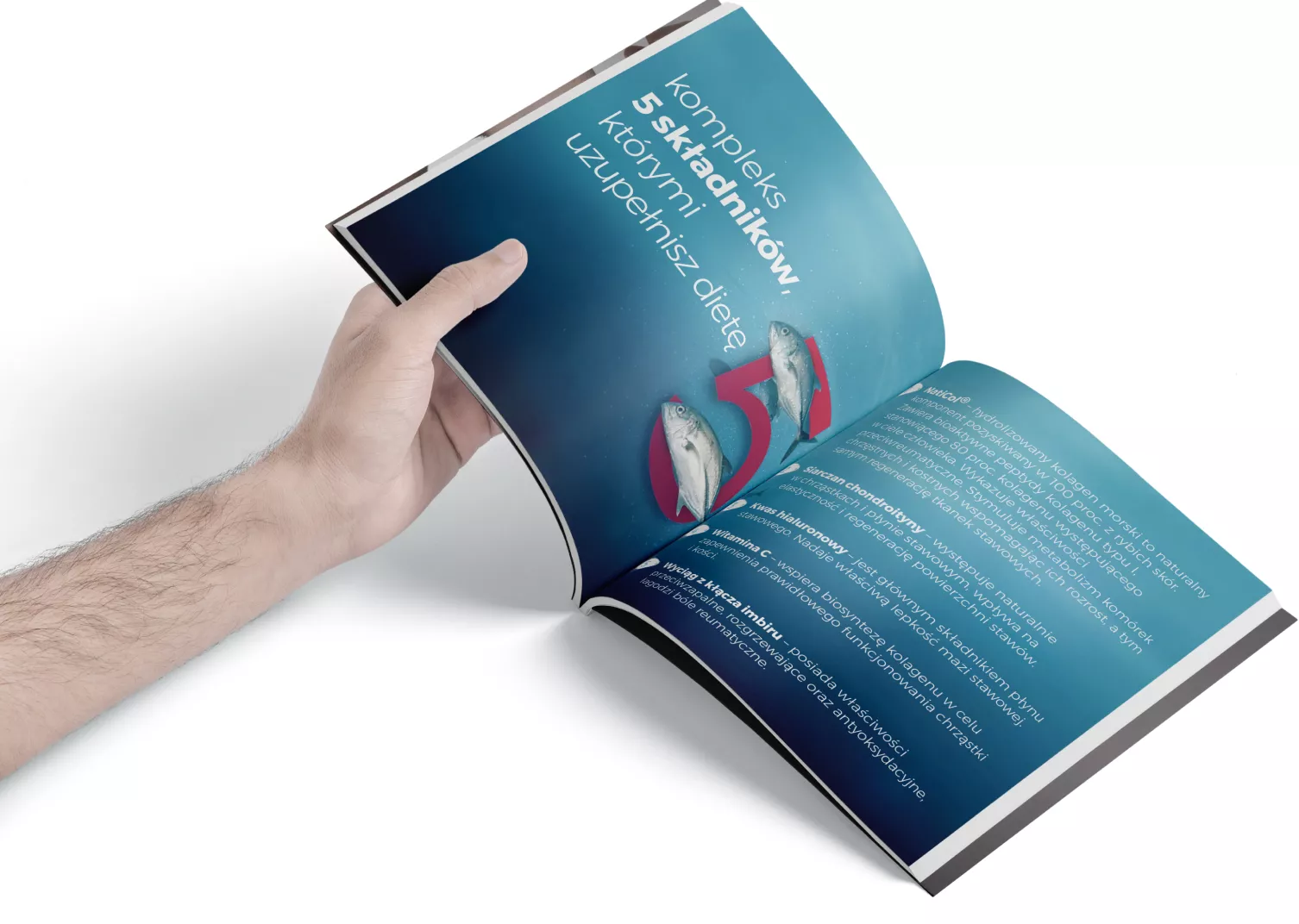
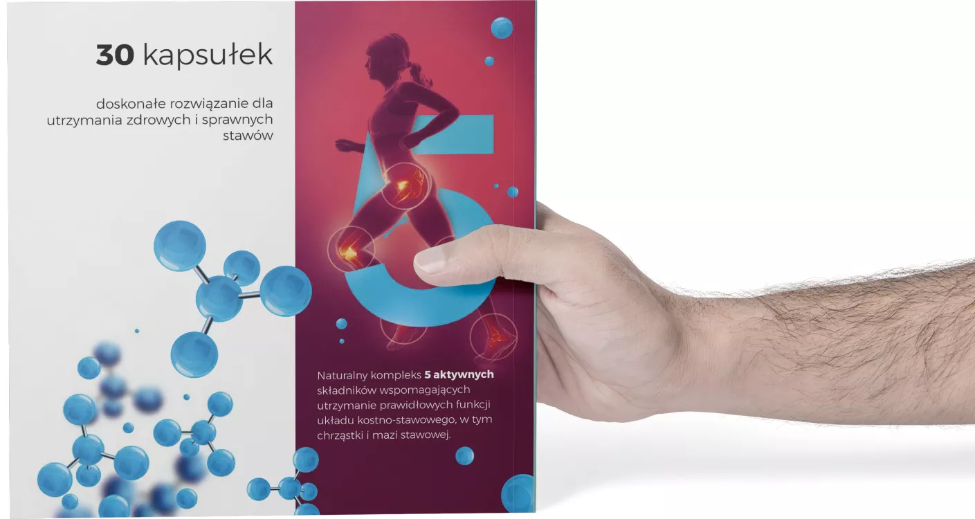
The main product series includes: Renostav®, Renostav Active®, Homocyne, Sellesto®, Nervena®, Viscort and Magnesium B6. To emphasize the individual character of each, we have created a logotype and a Key Visual referring to the use of a given supplement.
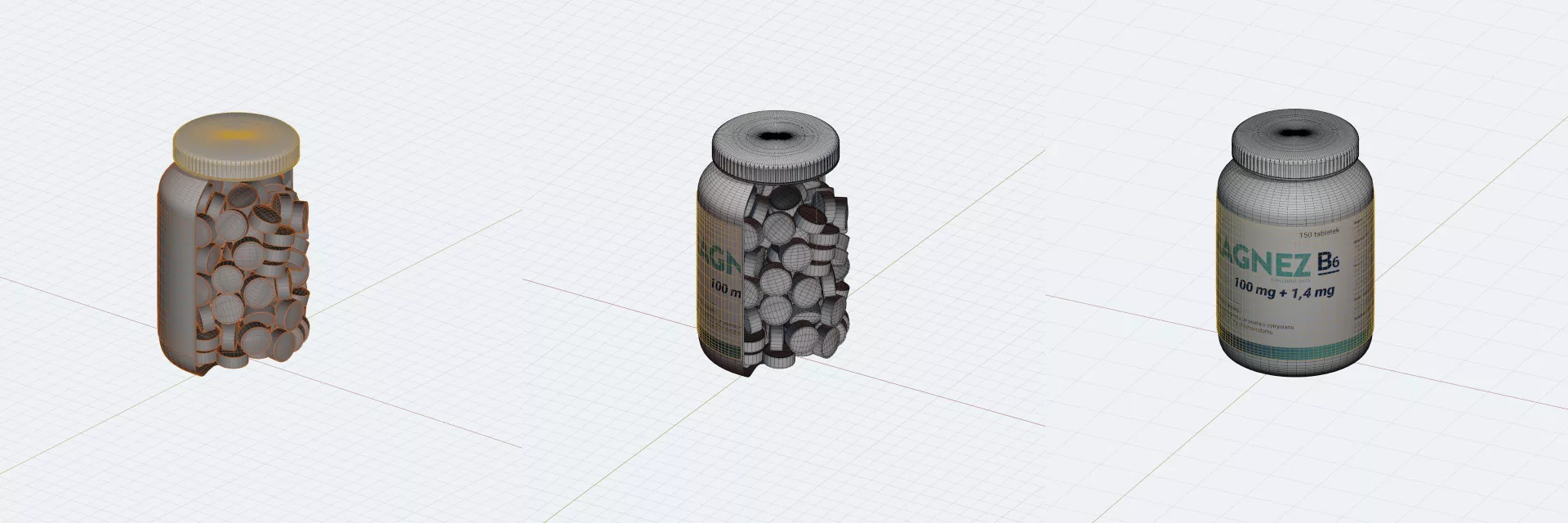
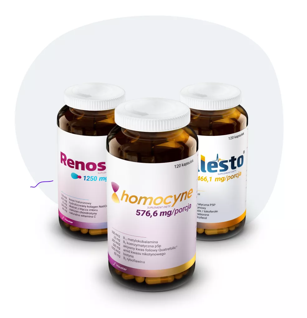
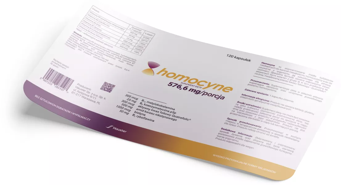
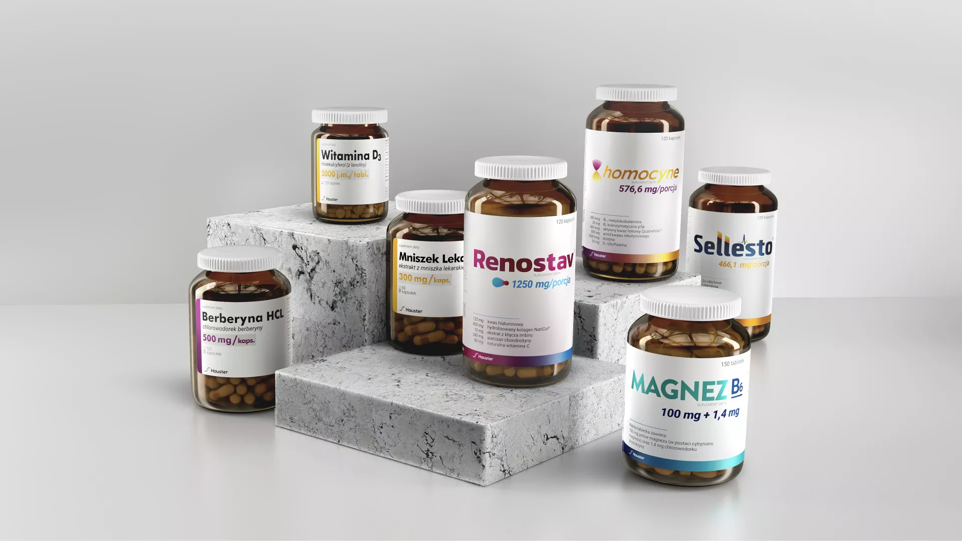
To maintain a coherent message, we have designed a series of labels with a uniform layout. The arrangement of individual elements on the label is unchanged, while each product is assigned an individual gradient consisting of two colors and a logotype. The whole thing is complemented by a background that changes from a gradient to white. To emphasize the class of products, the labels are printed on a silver foil with a white underprint on the locales. As a result, the gradients and logos have gained a metallic color that shimmers when exposed to light.
Berberine, Dandelion, Vitamin C 1000 and Vitamin C with rose. Due to the fact that these products do not have individual names and logos, while designing, we have kept a consistent layout and each of them has an individual gradient assigned.
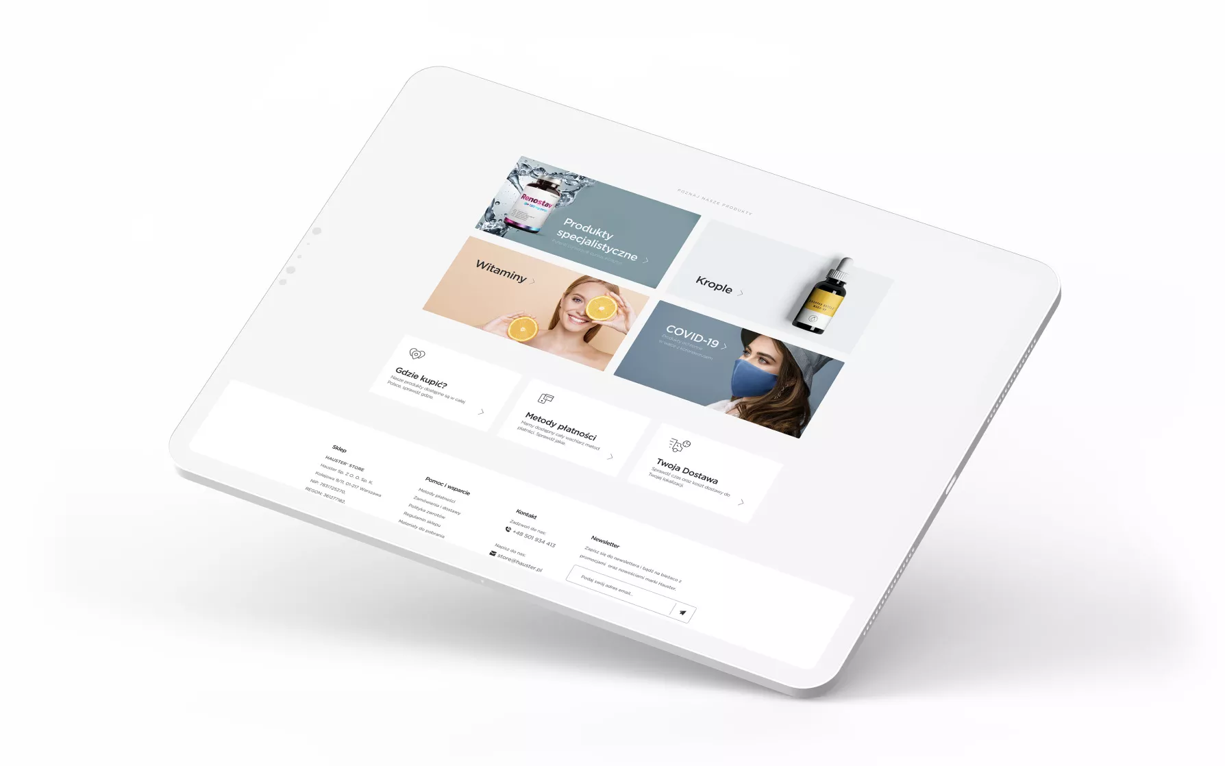
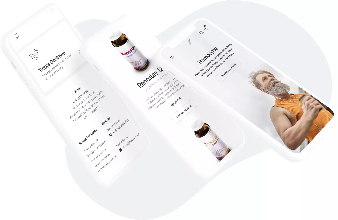
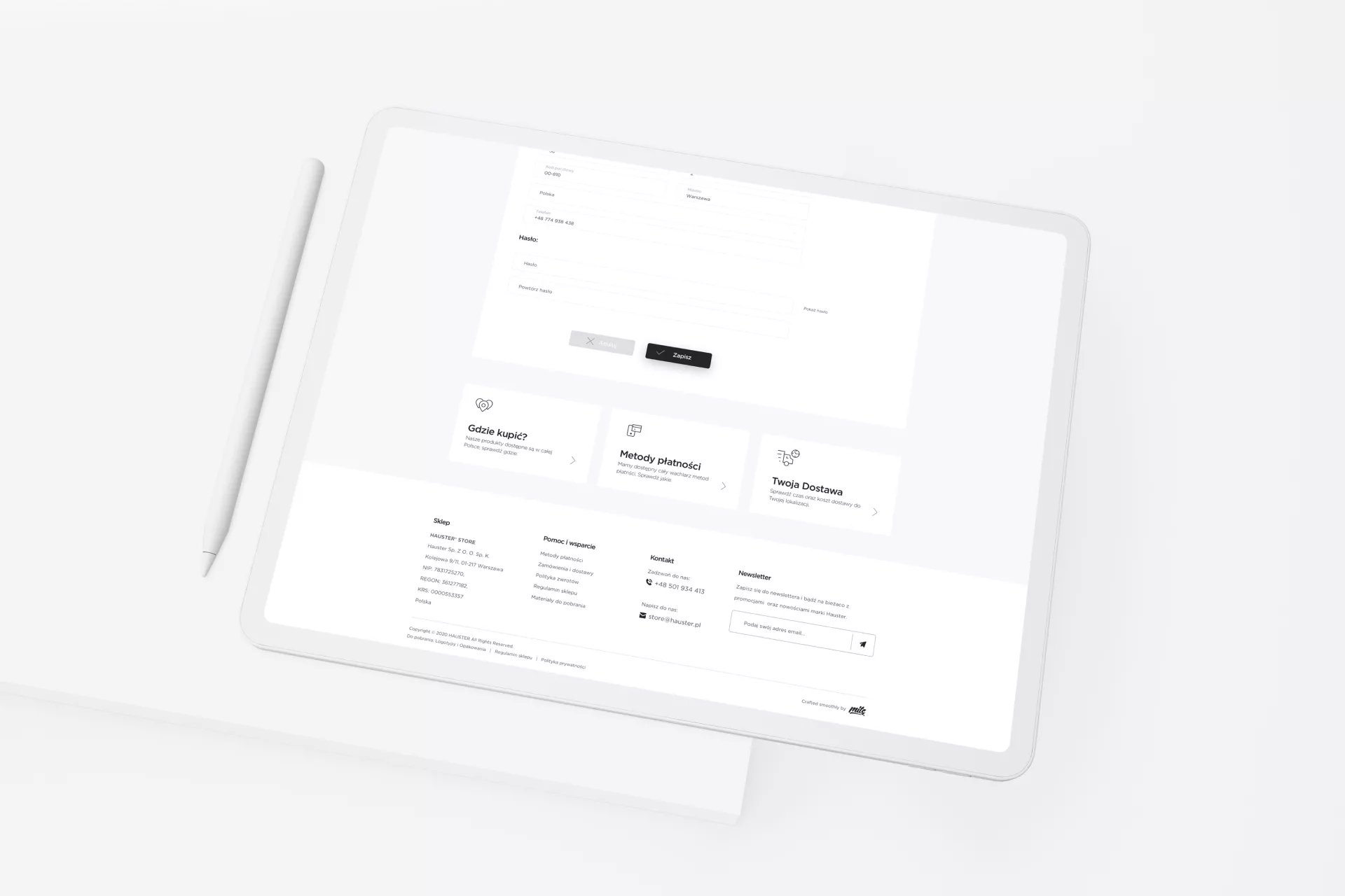
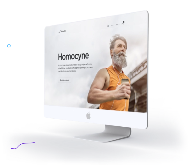
At the beginning of 2020, cooperation with the Hauster brand resulted in the creation of the Hauster® Store in a completely new version. The main goals of the redesign were to improve the usability of the website, in particular to increase the transparency of the interface, thanks to which we improved the readability of the presented content and simplified the purchasing process.
The minimalist design focused on the presentation of products, as well as the common e-commerce design patterns used, allow the user to easily find himself in the store. An important goal was also to speed up the operation of the store - in particular on mobile devices.
