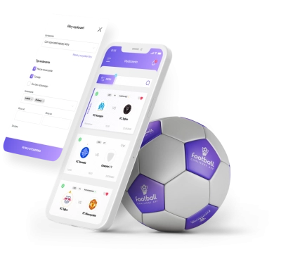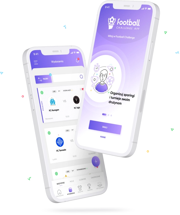
The football world on a regional scale is doing very well. There are many football clubs, both amateur and professional, operating at large sports clubs. There are regular events and tournaments dedicated to junior (and not only) teams. However, the problem is the management of events, the possibility of quick contact between the teams or an easy appointment for friendly matches. These functions were to be implemented by the Football Challenge App. The founders of FCAPP launched a mobile application in version 1.0 in 2019, but it did not meet its assumptions at a satisfactory level. Recommended by Akanza - friendly software, a moment later we started looking for a solution to the problem.
In order to get to know the application, its problems and define goals, we started our cooperation by organizing a scoping session and user experience workshops. The meetings allowed us to learn more about the structure and functionalities, as well as the requirements for the application itself. The result of the analyzes was the crystallization of key tasks for version 2.0 of the FCAPP application. The most important goals were to increase the usability of the application by rebuilding its structure and navigation, adding several new functionalities, including team ranking, notification system or live statistics and dividing users into 3 groups with dedicated functions. The Football Challenge App was to receive a new look & feel and be ready for implementation in less than 2 months.
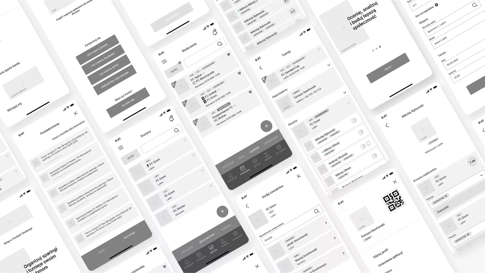
The result of the UX workshops was the development of key views in the form of functional mockups for each of the user types: Coach, Footballer and Guardian. Testing the functioning of the application from the level of each user group was important in terms of checking the interaction of these groups with each other.
The prototype showed many shortcomings of the original assumptions of the FCApp and allowed to eliminate them at the very beginning of the project. Thanks to user tests, we improved the key paths of users' movement around the application, shortening and facilitating their path and eliminating critical cases.
We started working on the interface by brainstorming and preparing a few stylistic concepts. For this purpose, we have created moodboards with proposals for a new visual direction for the application. After consultations with clients, we reached an agreement on the most important issues: colors, typography and the overall look & feel. The final UI design is a bright layout with clear purple headers and buttons. Strong, geometric font gives a modern, sporty character, and linear illustrations give great opportunities to animate and modify them depending on the needs and occasions.
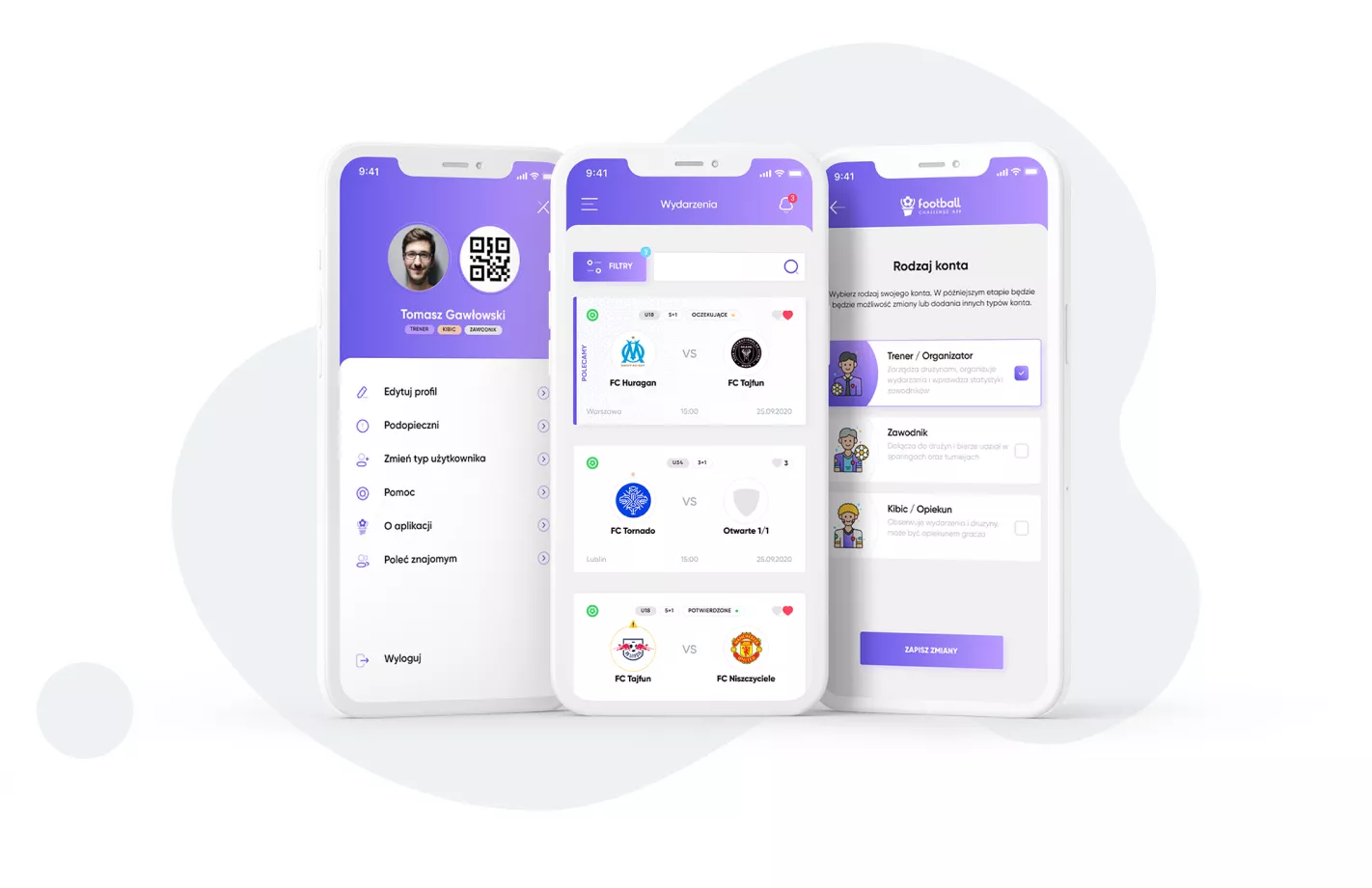
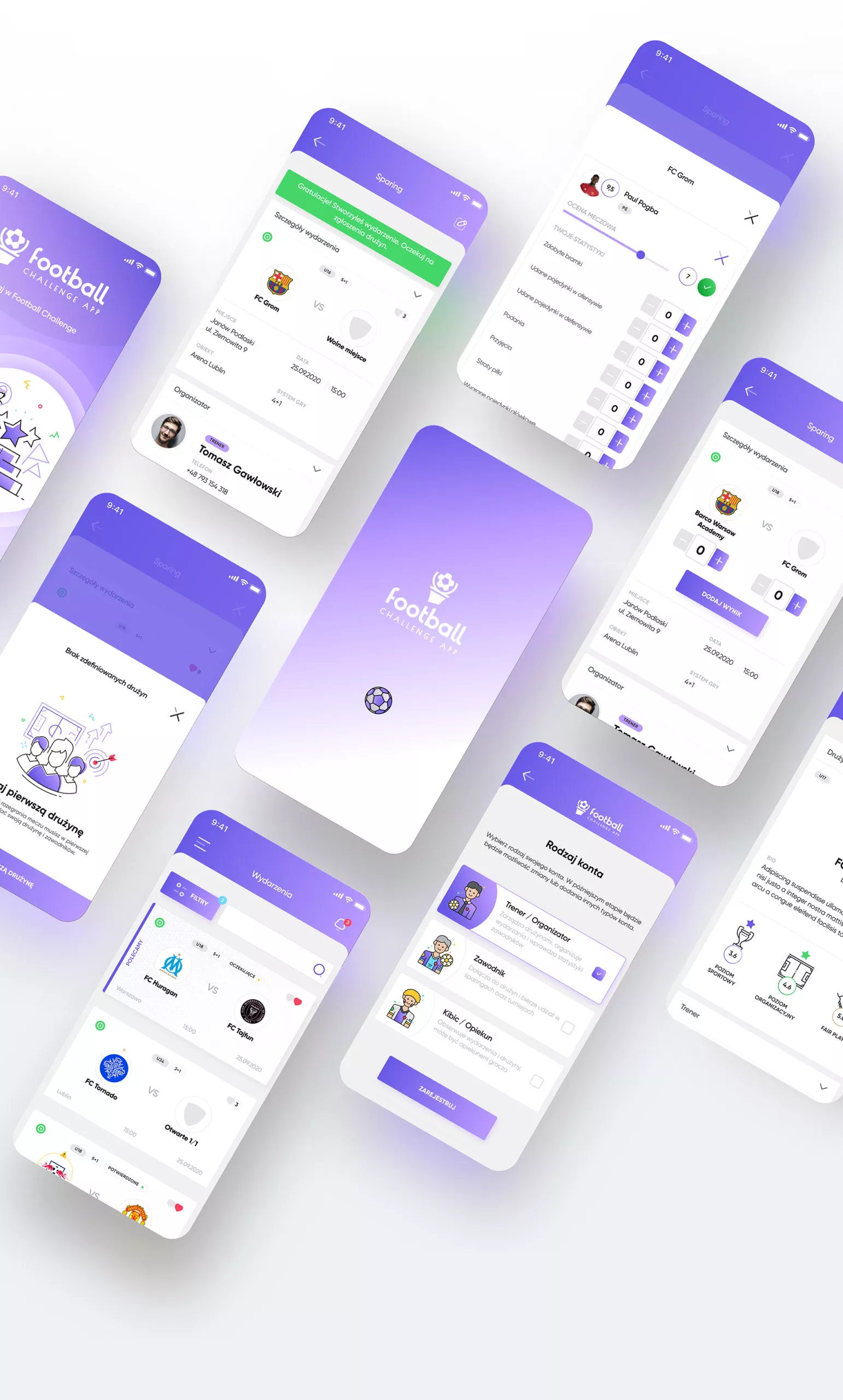
One of the primary goals was not only to improve the usability of the application, but also to add some new features. Among the most important is the division into 3 groups of users with the possibility of easy communication, e.g. on the Trainer - Parent line, an extensive notification system, the possibility of previewing results and statistics live or evaluating players. Additionally, we introduced team rankings and improved the process of creating events: sparring and tournaments.
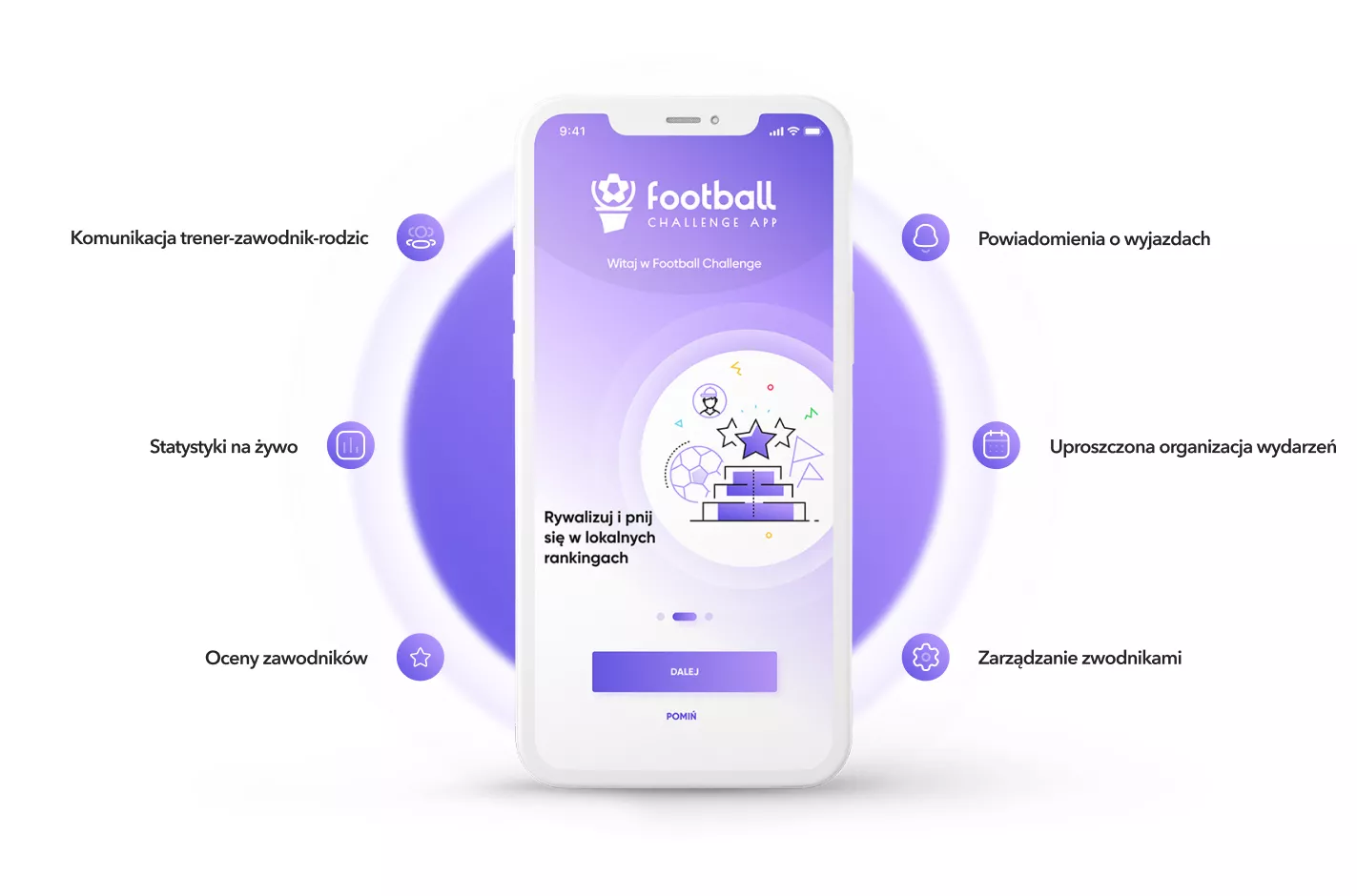
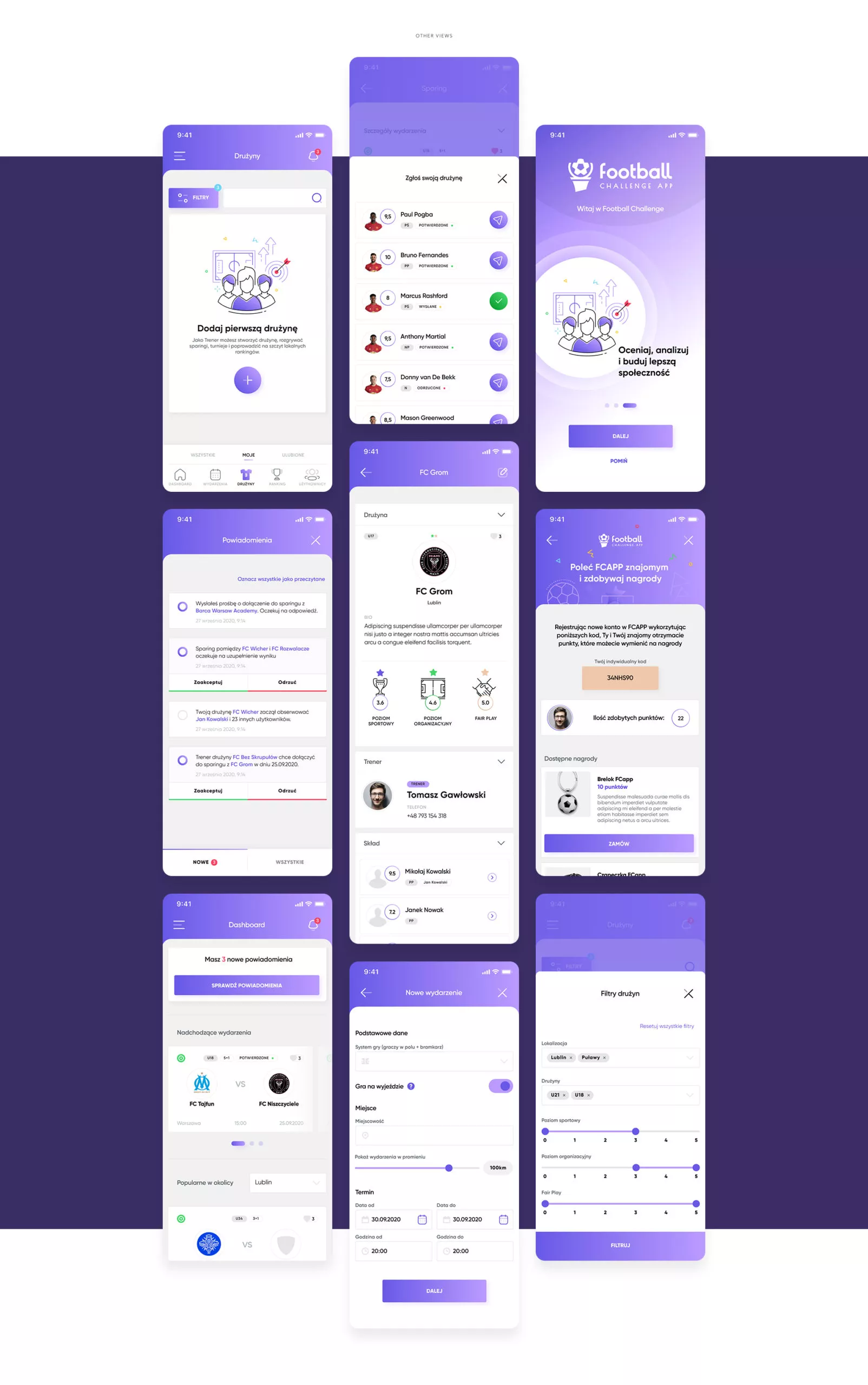
FCapp 2.0 also offers advanced filtering of events and teams. Users can find sparring partners from the area according to the ratings: sport level, organizational level or fair-play. And the best part is that the whole dating process is quick and easy.
Karol Kowalski
CPO FCApp

