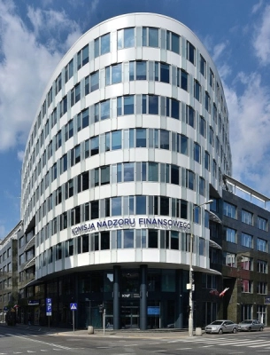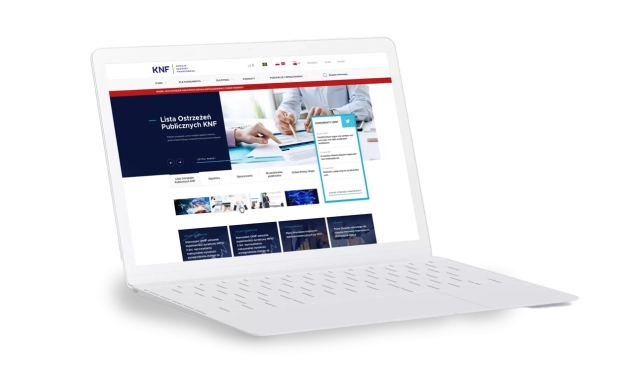
In 2017, the Polish Financial Supervision Authority refreshed its image by introducing a new visual identification. In addition to the new logotype, the institution decided to redesign the website. As Mits, we were part of this project.
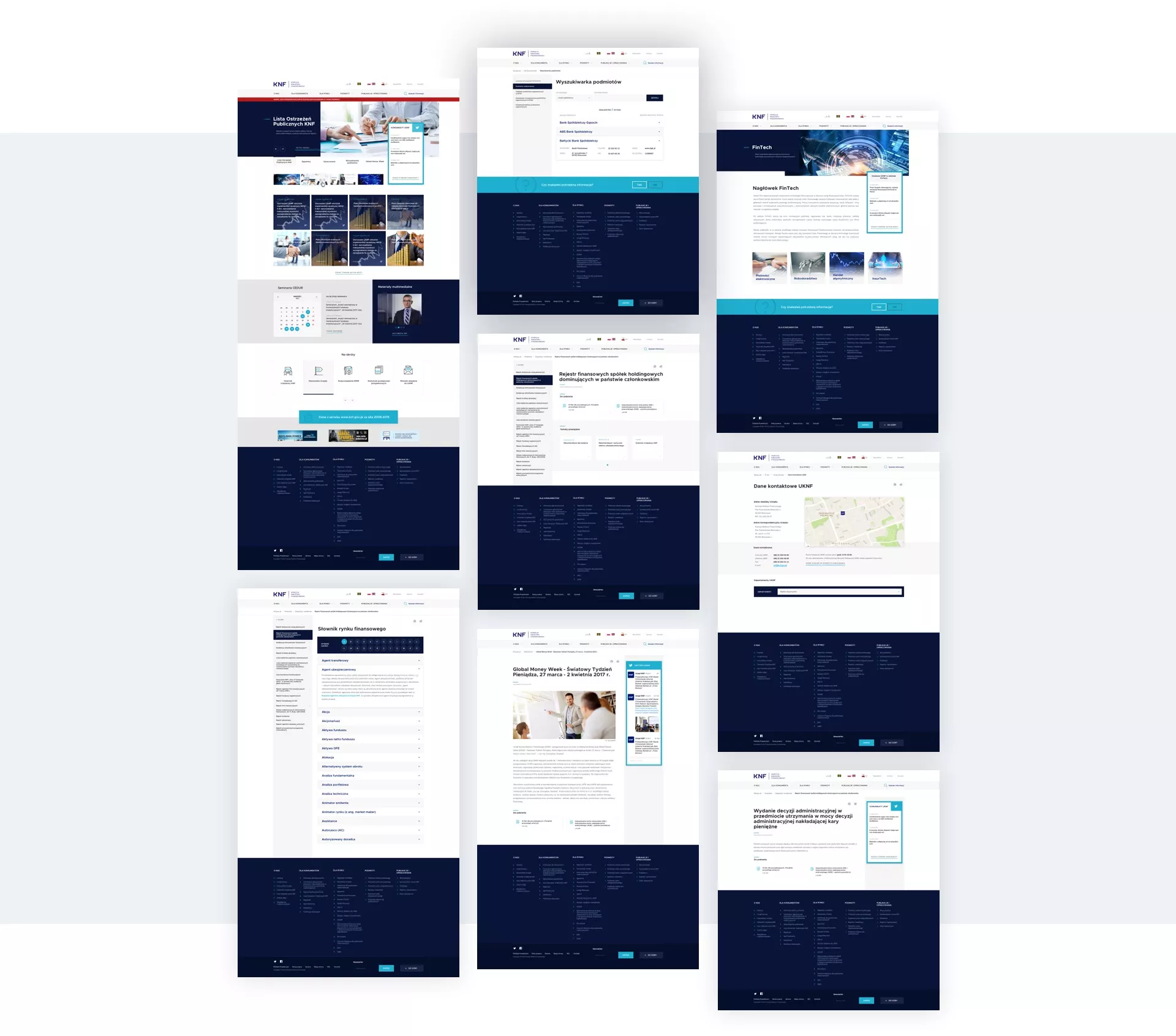
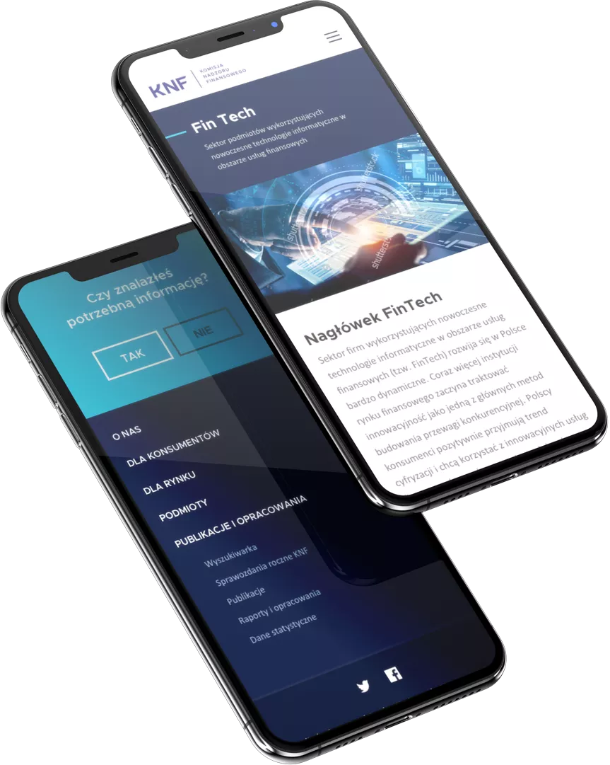
The most important goal of the new website was to harmonize the layout with the emerging rebranding of the KNF brand and to design a service that is as useful, transparent and tailored to a wide range of recipients. Therefore, it was necessary to prepare variants of the website for the visually impaired.
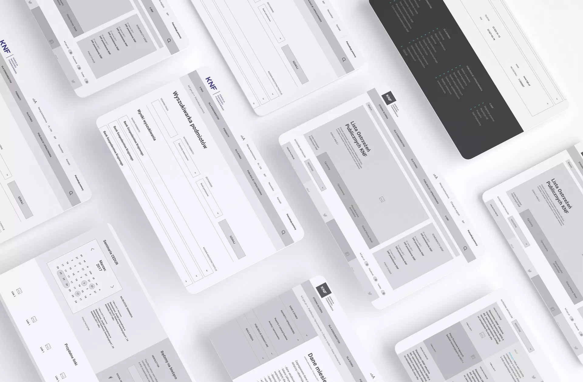
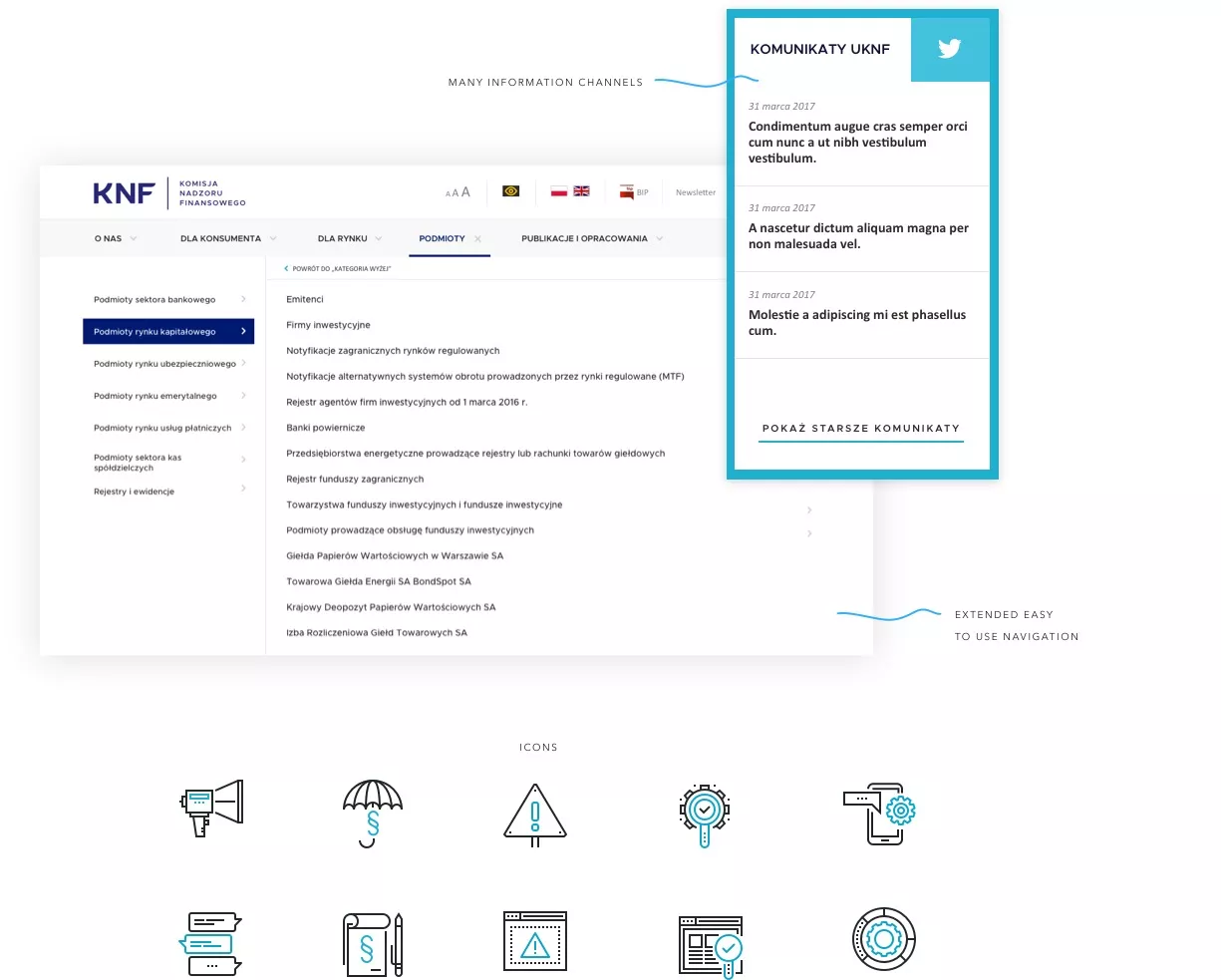
We started the design of the KNF website with a series of workshops with the client, which were to indicate the directions of the redesign. Based on the provided analytical data, personas and substantive tips, we have built the architecture of the website. We managed to establish that the key is easy access to the Public Alerts List, the ability to obtain current news, as well as quick access to training conducted by the Polish Financial Supervision Authority.
It was also very important to create an accessible website for the visually impaired, compliant with all WCAG standards. Having goals, we designed mock-ups, thanks to which we verified the possibility of their implementation.
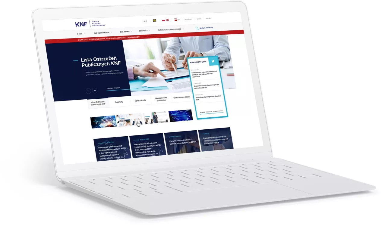
The new redesign of the KNF website refers directly to the rebranding. The typography and color used emphasize the seriousness of the institution, they are to build trust in the brand. Clear and readable interface elements fully meet the original assumptions of the project.
If you liked the way we work, let us know!
We will be happy to prepare a free quote,
which you will receive within 2 business days.
